We have recently added several tutorials/example notebooks of how to build several custom visualization in Spyral.
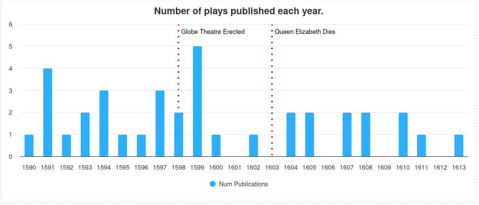
Bar Chart Demo
In the first notebook, located here, we have a tutorial on how to build a custom bar chart. As well, the tutorial also goes over how to insert extra context into the bar chart.
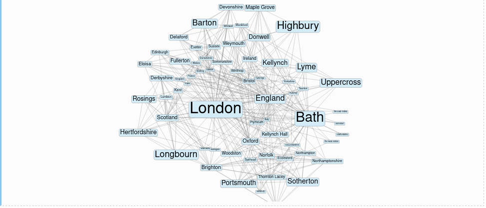
Analysing NER location data using network graphs.
In the second notebook, located here, we go through how to extract named entities from a corpus and then create a network graph based on how often each named entity appears together in a document. The tutorial goes over how to insert data into the table editor and then use that table editor to manually fix mistakes in the named entity data.
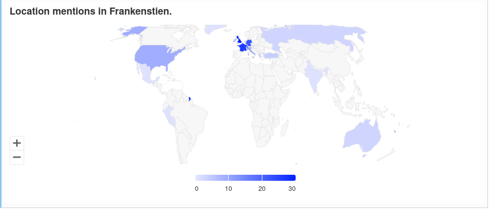
Mapping Named Entities with Highcharts
In the third notebook, located here, we used named entities and the Highcharts library to identify locations in a text and visualize them on a map. The highcharts mapChart module allows the user to select one of many maps, located here, that can be colored in a number of different ways.
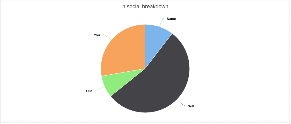
Visualizing categories using Pie Charts and Highcharts
In the final notebook, located here, we use categories to categorize the tokens in a text and then visualize the category breakdown with a pie chart using Highcharts.